#rafeolsen

"Rafe Olsen floors; inspired by nature "

Bringing the colours of world to your flooring

Rafe Olsen

What inspires us?

Quite simply, nature. For centuries people have taken readily available building materials from their natural surroundings to create and decorate their homes. The naturally occurring pigments in local areas produce the individual styles and trends seen throughout the world. If you consider the rich warm terracotta colours of the Mediterranean or the cool calm crisp whites and greys of Scandinavia, you can begin to see the world we live in as individual colour schemes. These naturally occurring colour schemes are what we use as the base for our floor colours.

RAFE OLSEN

PROVIDING A GUIDING HAND THROUGH YOUR PROJECT

Choosing a new floor can be a daunting task. In an ideal world, whatever floor you choose should harmonise with the interior of your home. To be in harmony doesn’t necessarily mean all aspects of your interior have to match but efforts should be made to ensure that they are complementary to each other. The last thing you’d want to have is floors and walls that clash. With our expert team we’re able to provide advice on which floor finishes are likely to complement your interior. Additionally, we provide larger than standard colour samples so you can really get a feel for how your bespoke floor will look. Below are some design aspects worth considering when choosing your new Rafe Olsen floor. For more information please don’t hesitate to contact us.

Contact Us

Starting with a blank canvas

Starting with a clean slate can be both the easiest, and most difficult place to start a design project. With the correct preparation and strong views about what you’d like to achieve, having a blank canvas is a fabulous base to work from.  But if your mind becomes slightly clouded about what your goals are, it can quickly become a nightmare of indecision and mixed finishes.

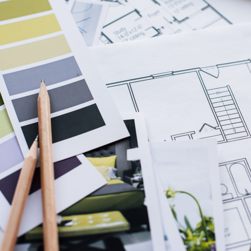
Our feeling is; preparation and clear design goals are the perfect base when starting a fresh. Luckily, there is a wealth of information out there if you know where to look for it. There are a myriad of interior design magazines that offer fabulous insight in to other peoples homes (don’t be afraid to use other peoples good ideas in your own project!), as well as expert advice on how to achieve certain styles. For more specific aspects of the design use the resources available on manufacturers websites; paint makers are a great place to start for colour inspiration (Farrow & Ball have a great website called The Chromologist) and you need look no further than our very own Rafe Olsen website for a helping hand with your hardwood flooring. Finally, the advent of social media has made sharing stunning design ultra fashionable and offers great ideas for all interior design aspects. Pinterest and Houzz are particularly useful.

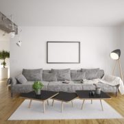
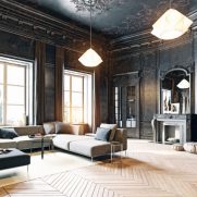
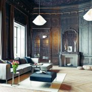
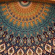
Mood boards work exceptionally well at bringing design concepts, colours and textures together to provide a snapshot of what your finished project may look like. They’re incredibly easy to put together and are often as important for showing up things that don’t work, as much as those that do.

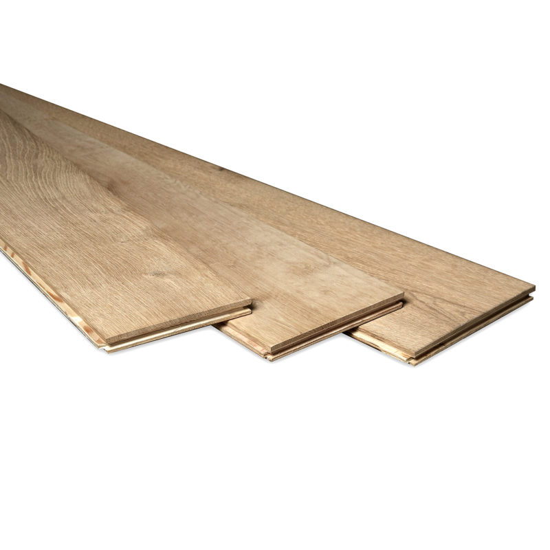
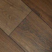
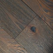
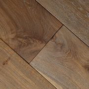
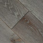
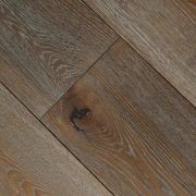
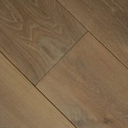
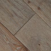
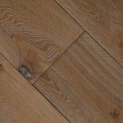
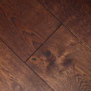
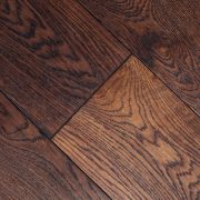
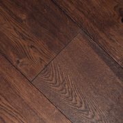
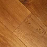
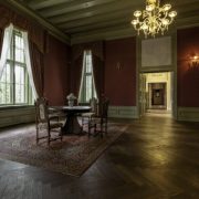
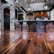
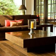
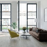
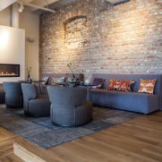
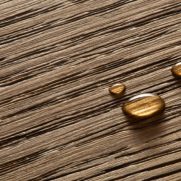
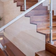
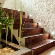
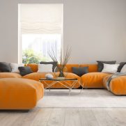
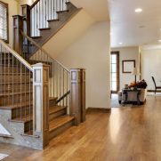
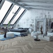
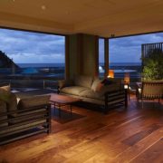
When considering your flooring, there are a few key considerations to make. These can go a long way towards finishing your project with a floor that really pulls all other design aspects together. Firstly consider the texture of your wood flooring; the more distressed a board is, the deeper and more intense the colour. The distressed boards also have an aged feel underfoot. If you are looking for a clean and contemporary feel, stick with smooth or lightly brushed floors. Secondly, think carefully about the colour. Are you looking for a floor that makes a statement for the whole room or something that almost disappears seamlessly in to the interior. Try to consider the flooring as a major part of the colour scheme, like you would with the walls and ceiling. Lastly, consider how your floor will work with the furniture on your wish list. Try to avoid mixing too many natural wood colours unless they are all in the same tone.

Above all else, remember it’s your project. Add your own stamp on it if you can, but as long as you are happy with the outcome, nothing else matters!

Considering board widths

The width of the floor boards you choose may not immediately register as a critical consideration but past experience has shown us it can have a major effect on the overall appearance of your flooring. The goods news is the formula for working out what’s best is very straight forward. Basically, the bigger (and wider) the room, the wider the floor board it can accommodate. Using big wide planks in confined areas can make a room look smaller than it is. Big open spaces generally look better with wider planks because narrow flooring can feel a little lost in the expanse. The exception to this rule is when using Parquet style flooring. The intricate patterns negate room size entirely to give a great variety of uses.

If in doubt, choose a slightly smaller width than the maximum your room can accommodate. Finally, try and make sure when installing the flooring that you run the length of the boards in the same direction as the longest side of the room. This will help create a feeling of the room being larger than it really is.

light & how it affects your floor

Artificial or natural; North, South, East or West facing? Work with the light that you have in your space rather than against it.

Artificial (created by internal lighting) and natural (any light entering the home from outside) lighting can create a myriad of different colours, tones and shadows on your floor. What can look to be the perfect colour and finish for a room can look entirely different when put in situ. 

Artificial light can cast shadows in places you wouldn’t expect them and create colours that you didn’t anticipate. It’s important to know what kind of colour your interior lighting is; generally older generation halogen and incandescent bulbs cast a warm yellow light which tends to make interiors feel warmer and enhance the rich darker flooring colours. Modern LED bulbs are often set to produce a much brighter blue light. This is often closer to how natural light is seen and works particularly well with cooler modern whites and greys.

As mentioned, natural light tends to be brighter and whiter than many artificial lights, but there are consideration to make about from which direction the light enters the room. Rooms with North facing windows or openings will always appear darker, with whatever light does appear, seemingly cool and harsh. It’s best to embrace it for what it is and look towards dark colours or whites and greys on the cool tones. If you’re lucky enough to have a room that is South facing, the world is your oyster! Stunning natural light all day long means virtually any colour floor will look great. Choose pale finishes to really maximise the light and create a space that is open and airy.

If your rooms happens to be facing East or West, bear in mind that the light changes throughout the day. It’s worth considering when you are likely to using the room most and try to maximise the natural light at that point. Easterly rooms tend to be very bright in the morning followed by a cooler blue light in the afternoons. This tends to lend itself well to use of pale washes of blue and green. As you would expect, West facing rooms work the opposite to Easterly ones. Brighter in the afternoon than the morning; the use of whites tends to work very well, particularly cooler tones.

This is where Rafe Olsen’s flooring samples are critically important. They can be placed in various spots around the room to garner the full effect of the light that is on offer.

Stay in the know